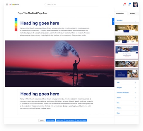
Process, approach, and outcomes:
Context
When I first started at eBay, I looked after Site Builder as a designer: creating new components and supporting teams across the company with their site builds.
The problem: 80 components, one endless scroll
Over time the sidebar filled with components, roughly 80 of them stacked on top of each other, and finding the right one became a real problem.
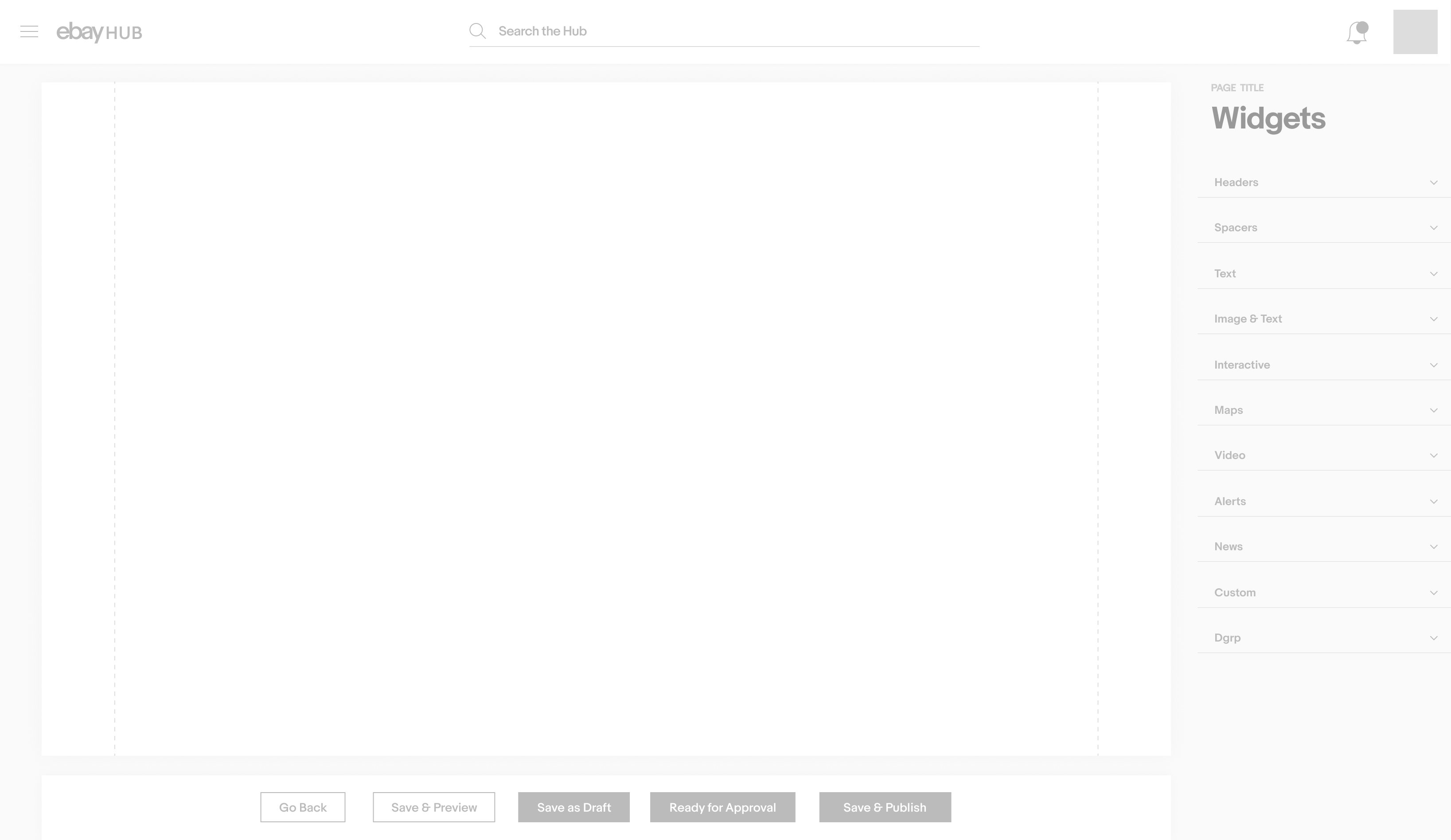
I sectioned the components into dropdown groups so they were easier to identify, and the endless scroll went away.
The redesign
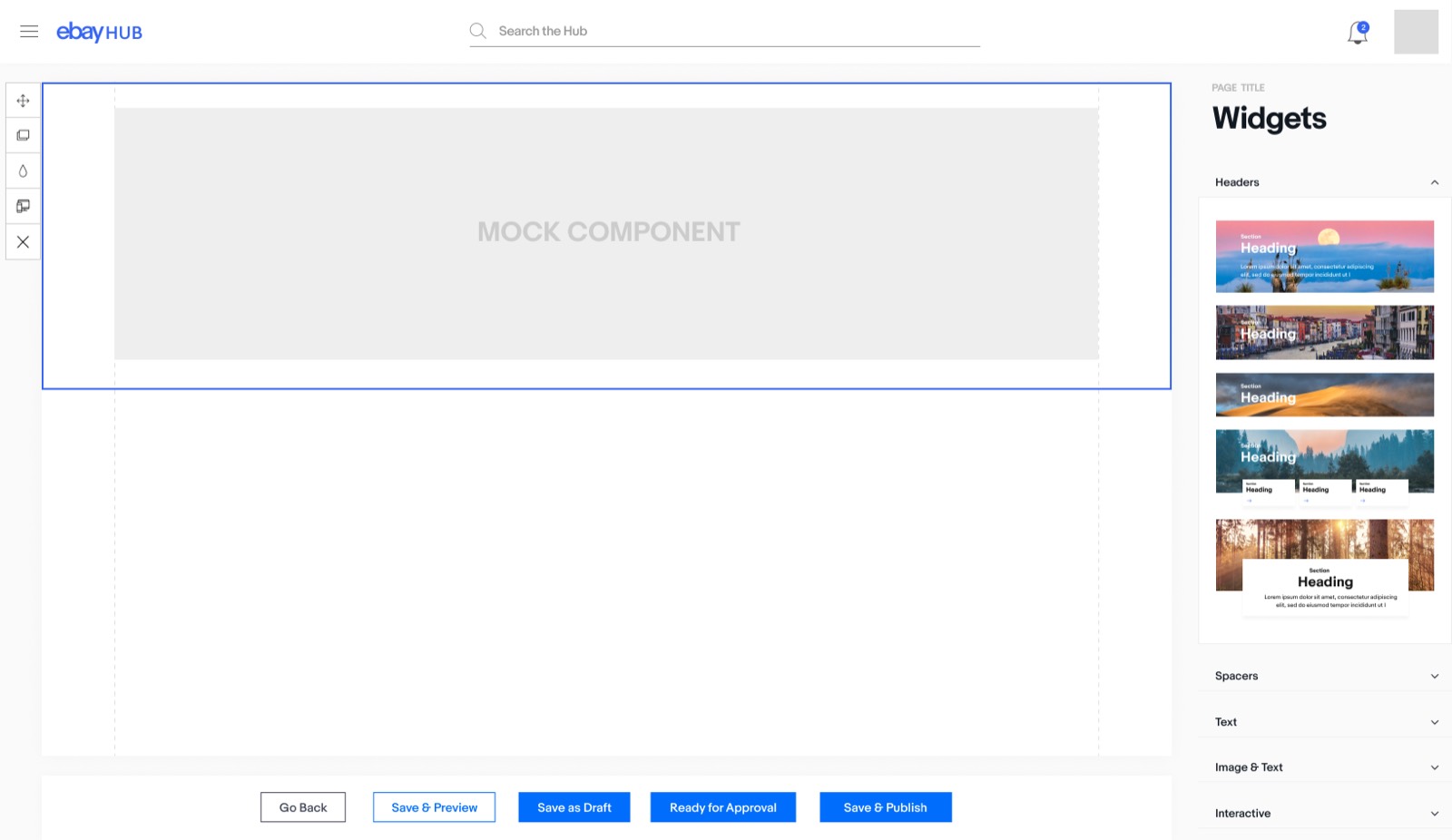
The UI was updated to reflect eBay’s recent design-system changes. The page canvas was separated more clearly from the other elements on screen, and a full-screen editing mode was added to free up real estate when editing content.
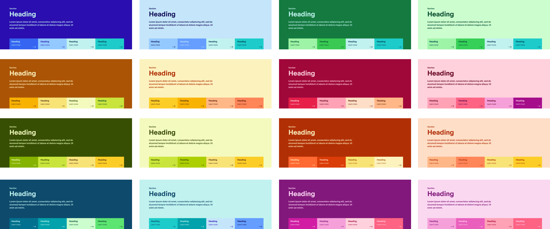
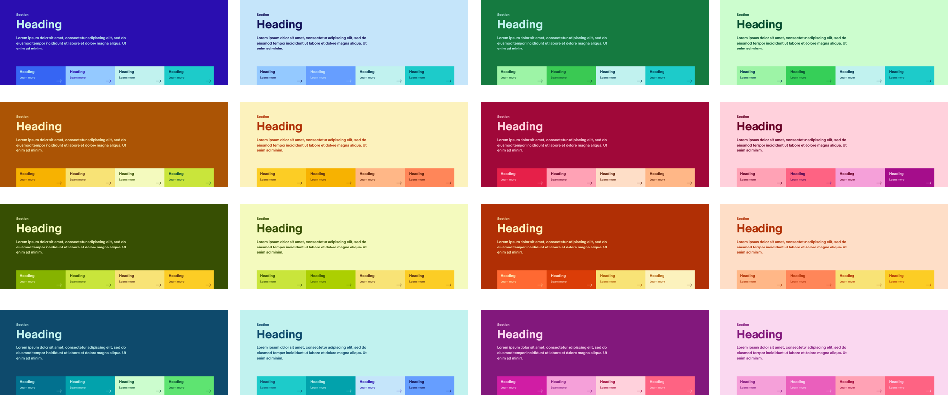
The component thumbnails were reworked to be larger and clearer, carrying more visual information, with tooltips on hover providing a description of each component.
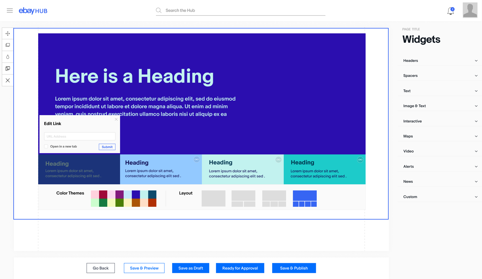
Then I built it
After much pleading for engineering resources to build the design out, I decided to try and code it up myself. My manager was kind enough to give me the time to do it.
The outcome
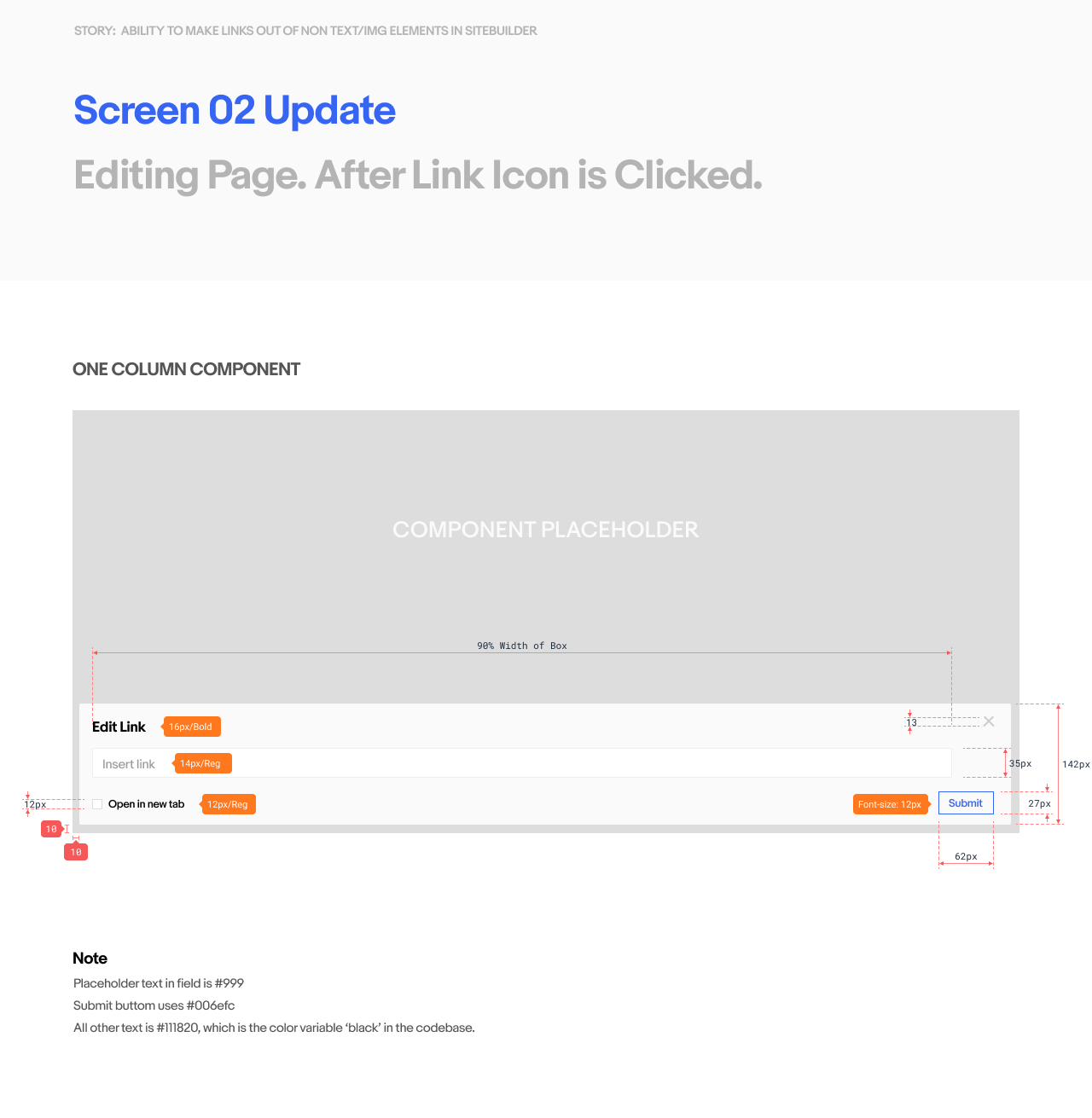
The redesign was well received by users and stakeholders. It made components easier to find, brought the UI in line with eBay’s design system, and because I built it myself, what shipped matched the design exactly.