The problem, the process, and the results:
The problem
The project started at the beginning of Covid, when eBay moved to remote work and everyone’s online life at work suddenly mattered more. Two core parts of The Hub weren’t ready for that.
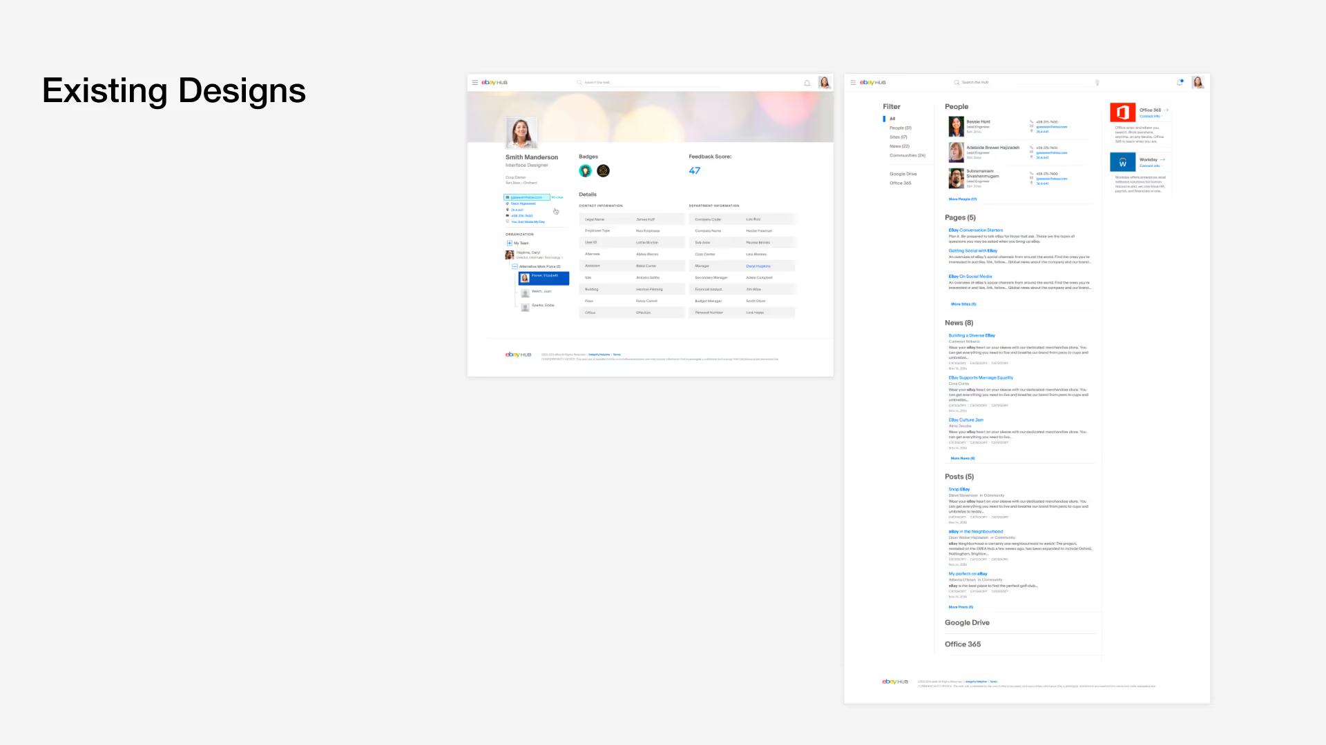
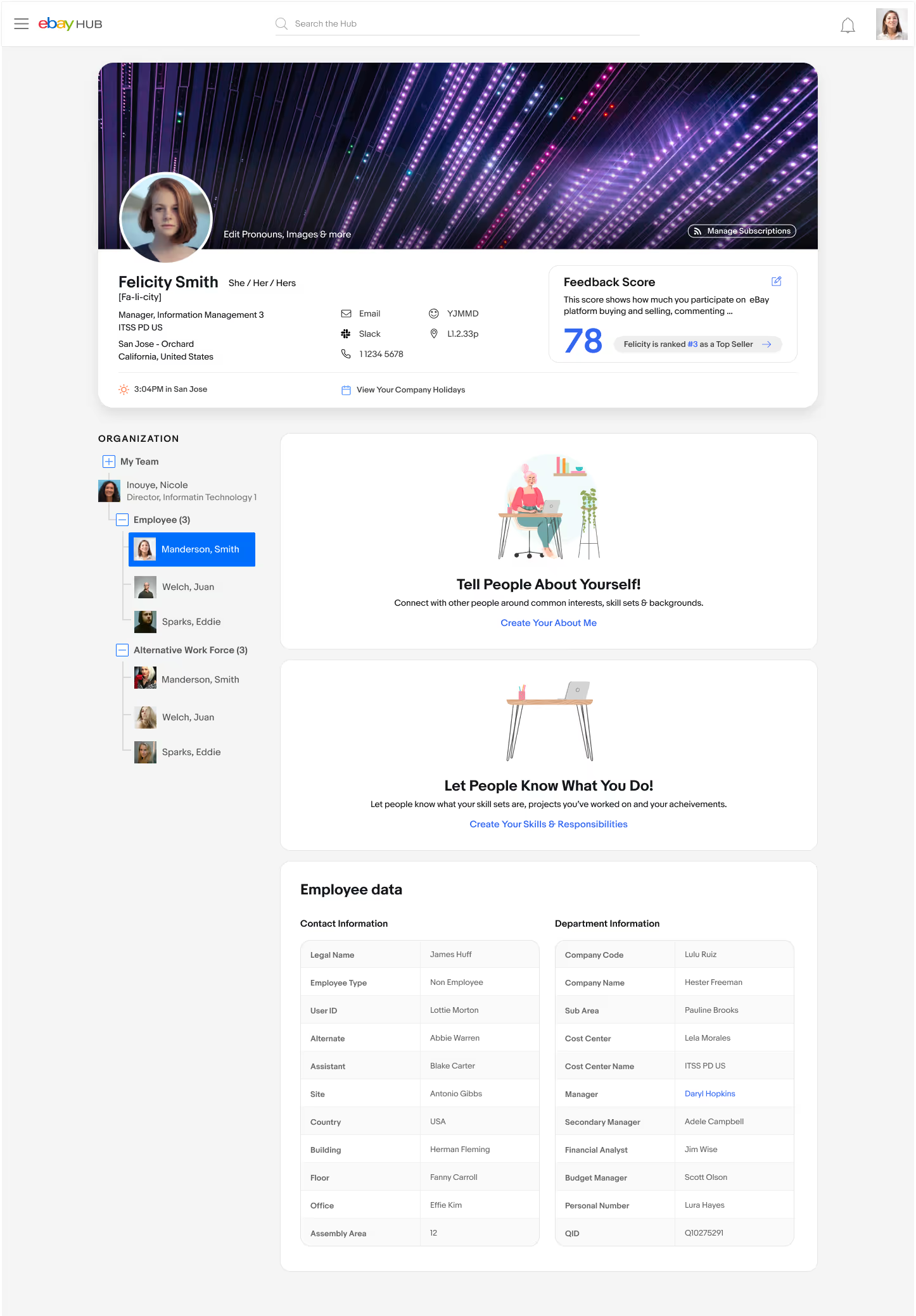
The employee profile gave people no way to represent themselves: no photos, no bio, no interests, no skills. It was also used for internal recruitment, and with so little on it, there was almost nothing to find.
Search only covered The Hub itself. The knowledge base, Office 365, Google Drive and the other tools people used every day were invisible to it, and the results it did return were often wrong. People fell back on asking colleagues where things were.
Research
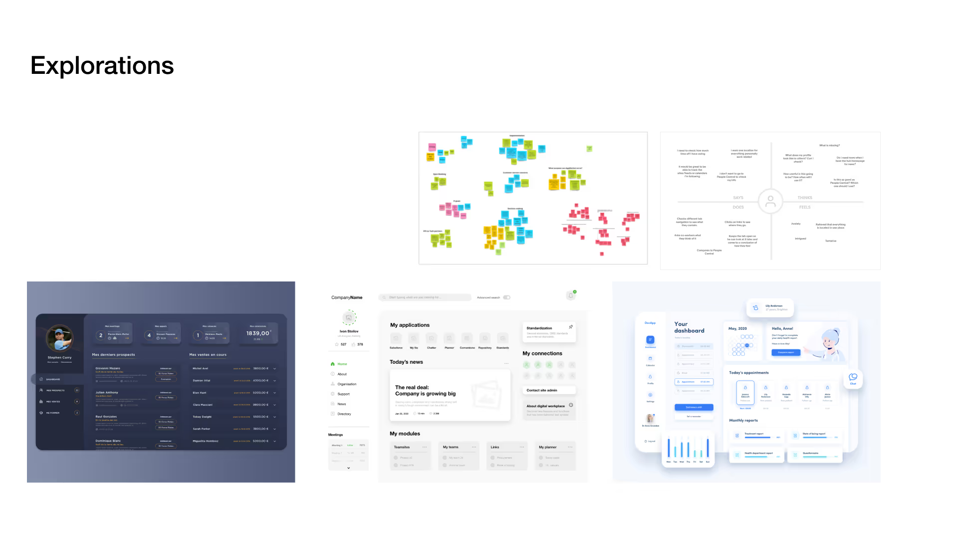
I worked from four sources: stakeholder meetings with the corporate communications team, user interviews and focus groups, feedback surveys, and platform analytics. The quotes were blunt. “The search results are not very helpful.” “I can’t find what I’m looking for.” “The profile is super boring.”
I audited the existing screens issue by issue and used that to agree the scope with stakeholders.
Exploration
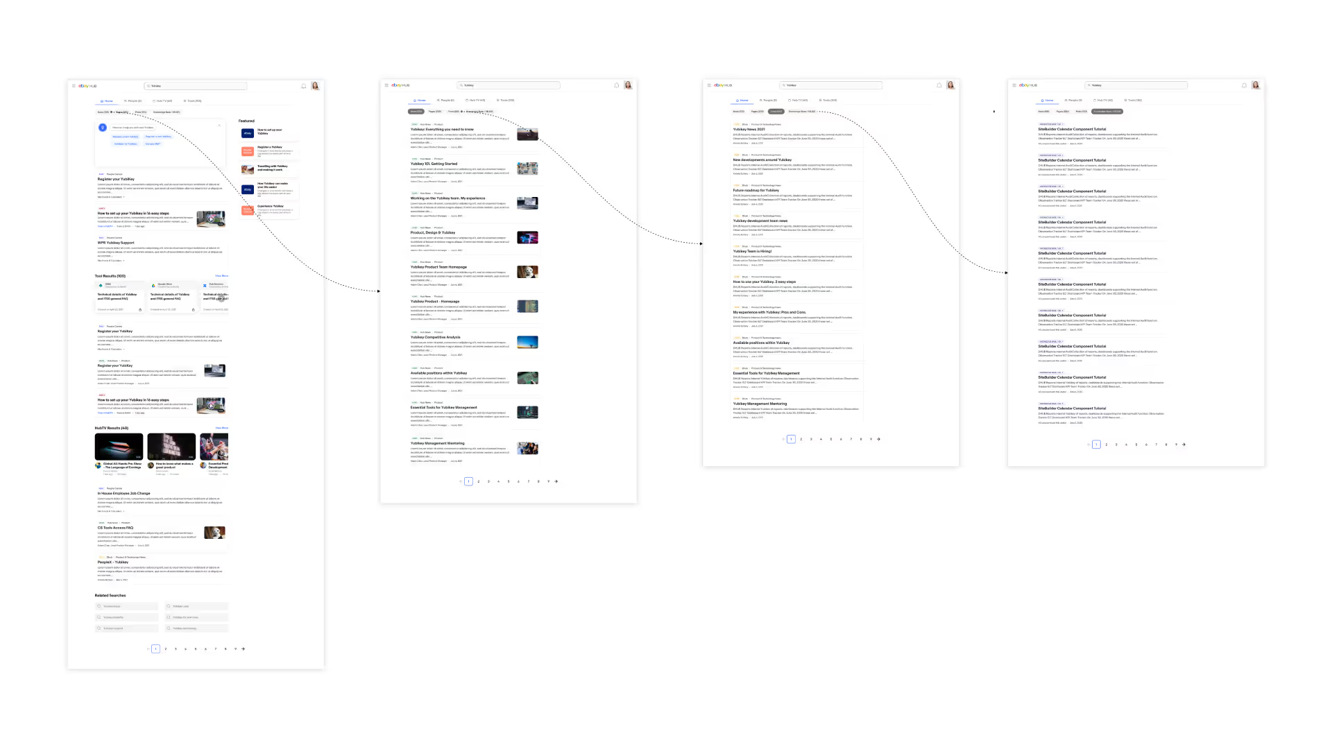
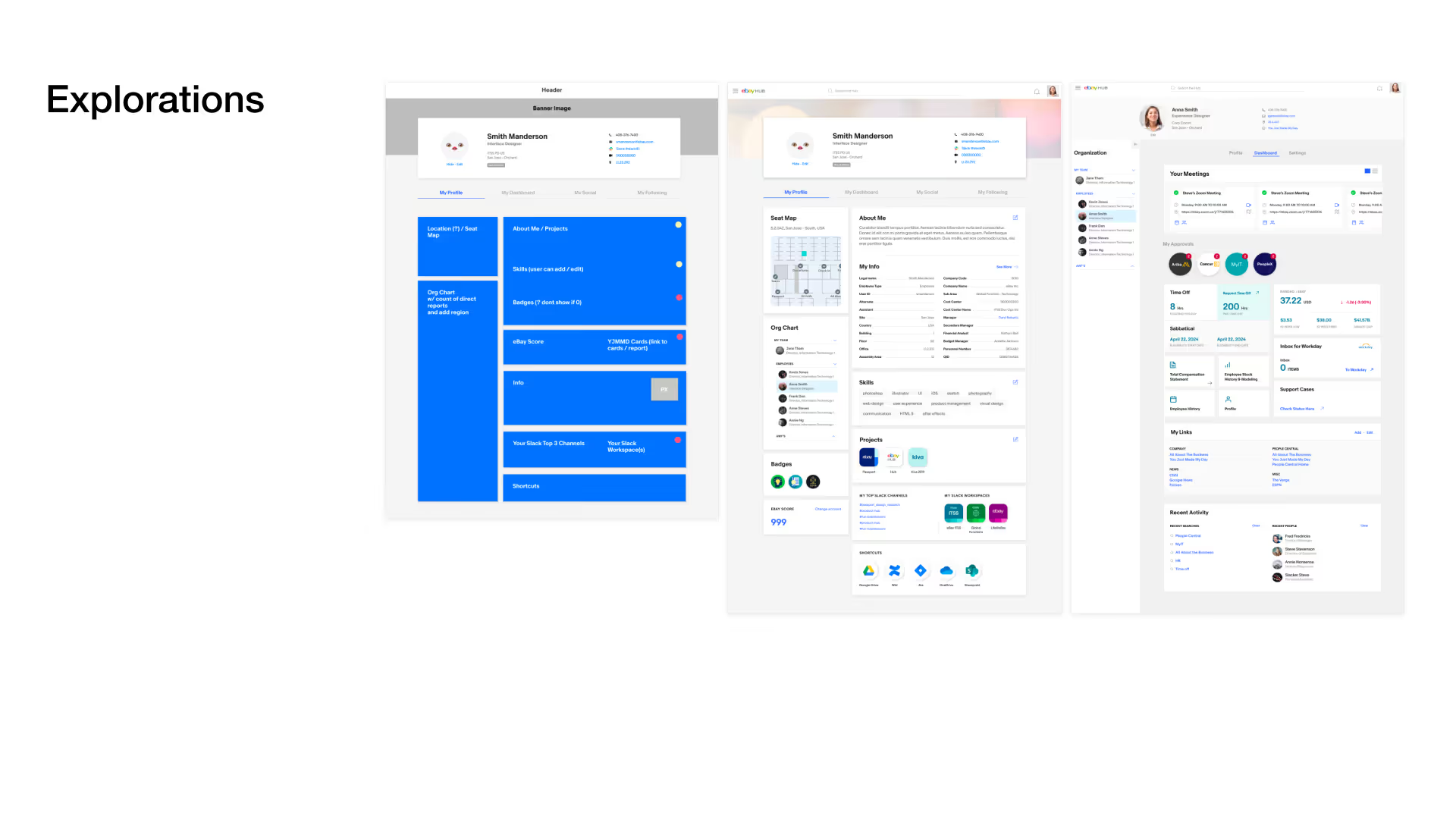
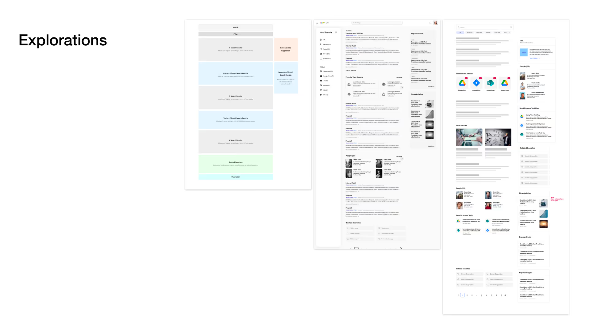
Flows first, then wireframes, then refined mockups. Search and profile were designed together from the start, because the research kept showing they were two halves of the same task: finding a person, then finding what they’re working on.
One page, two jobs
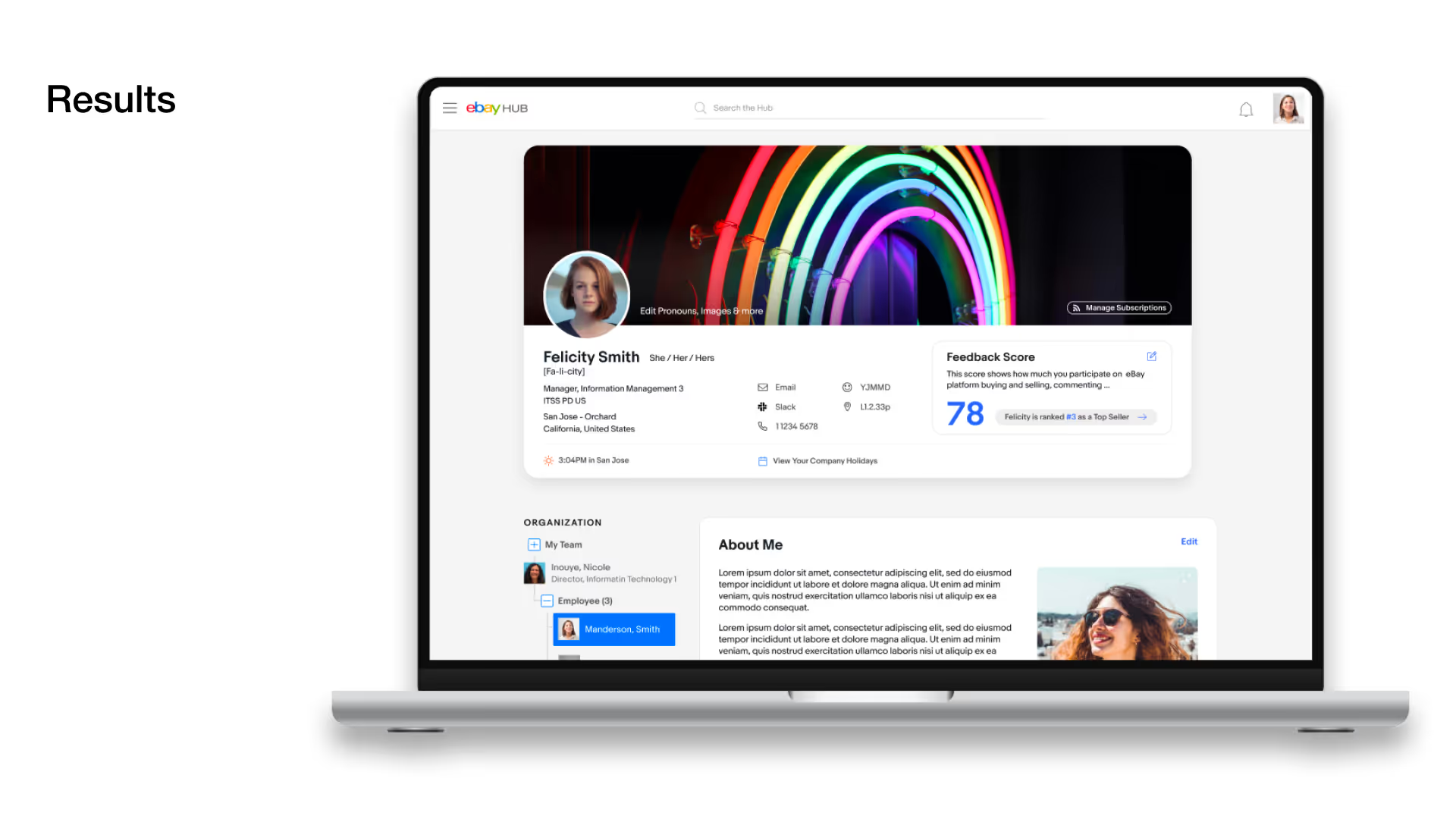
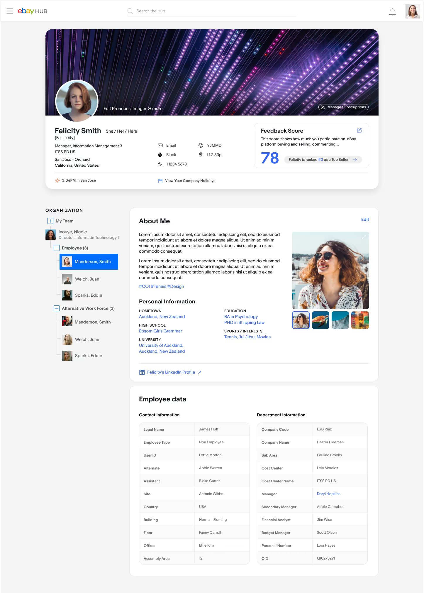
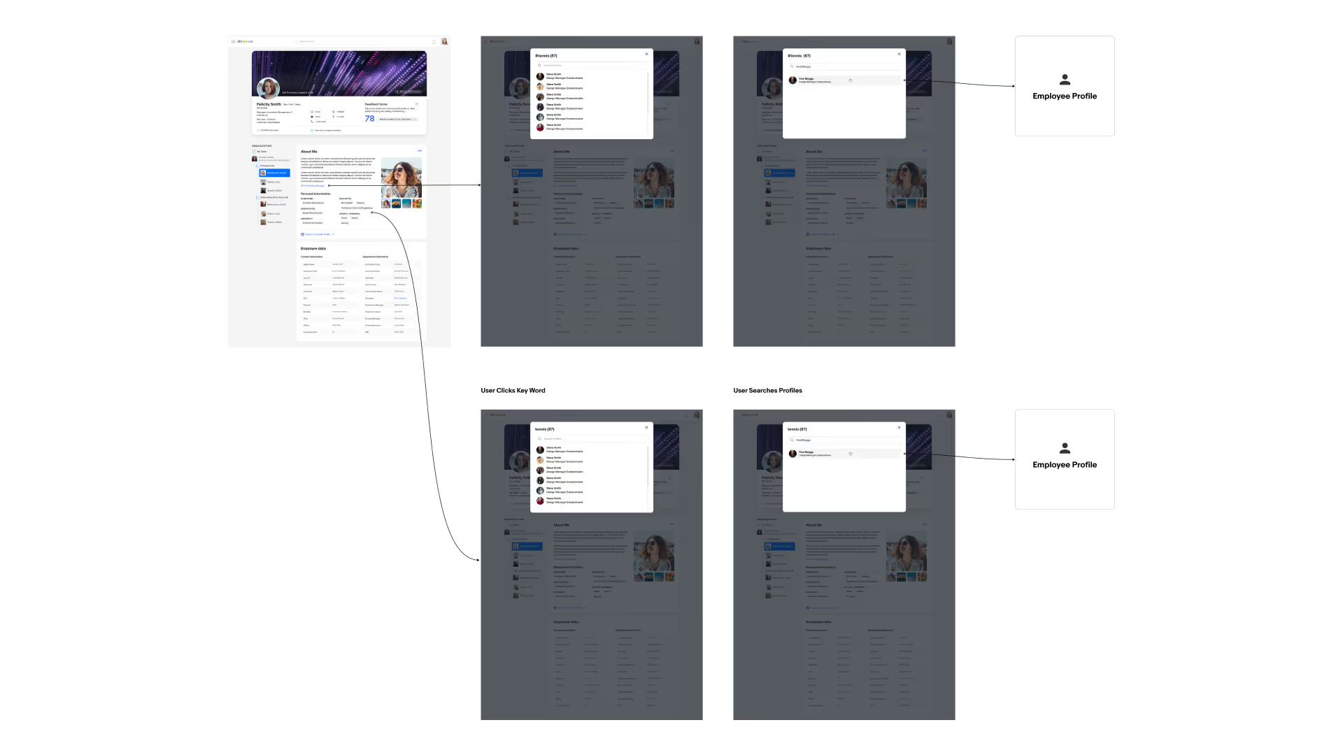
The employee profile has to work in both directions: it’s how you present yourself inside the company, and it’s how everyone else finds your role, your team, your work, and how to reach you. The redesign brought both jobs onto a single, scannable page.
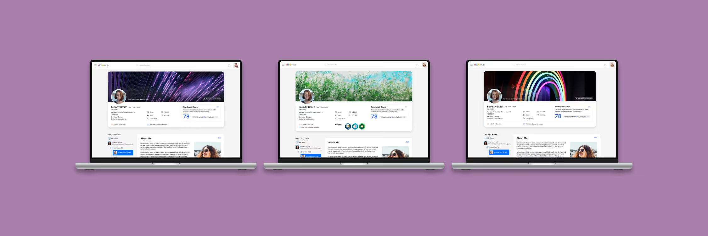
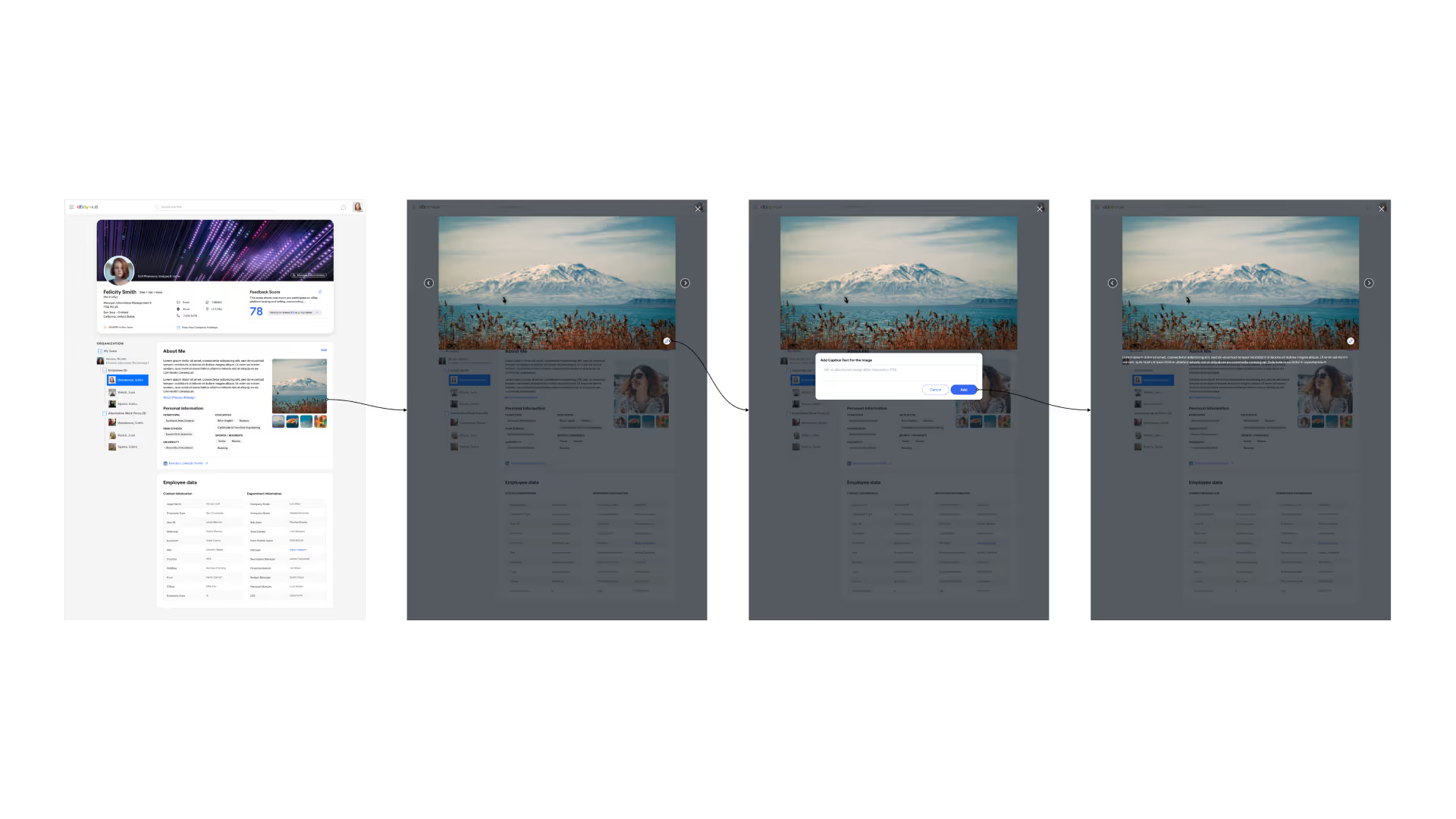
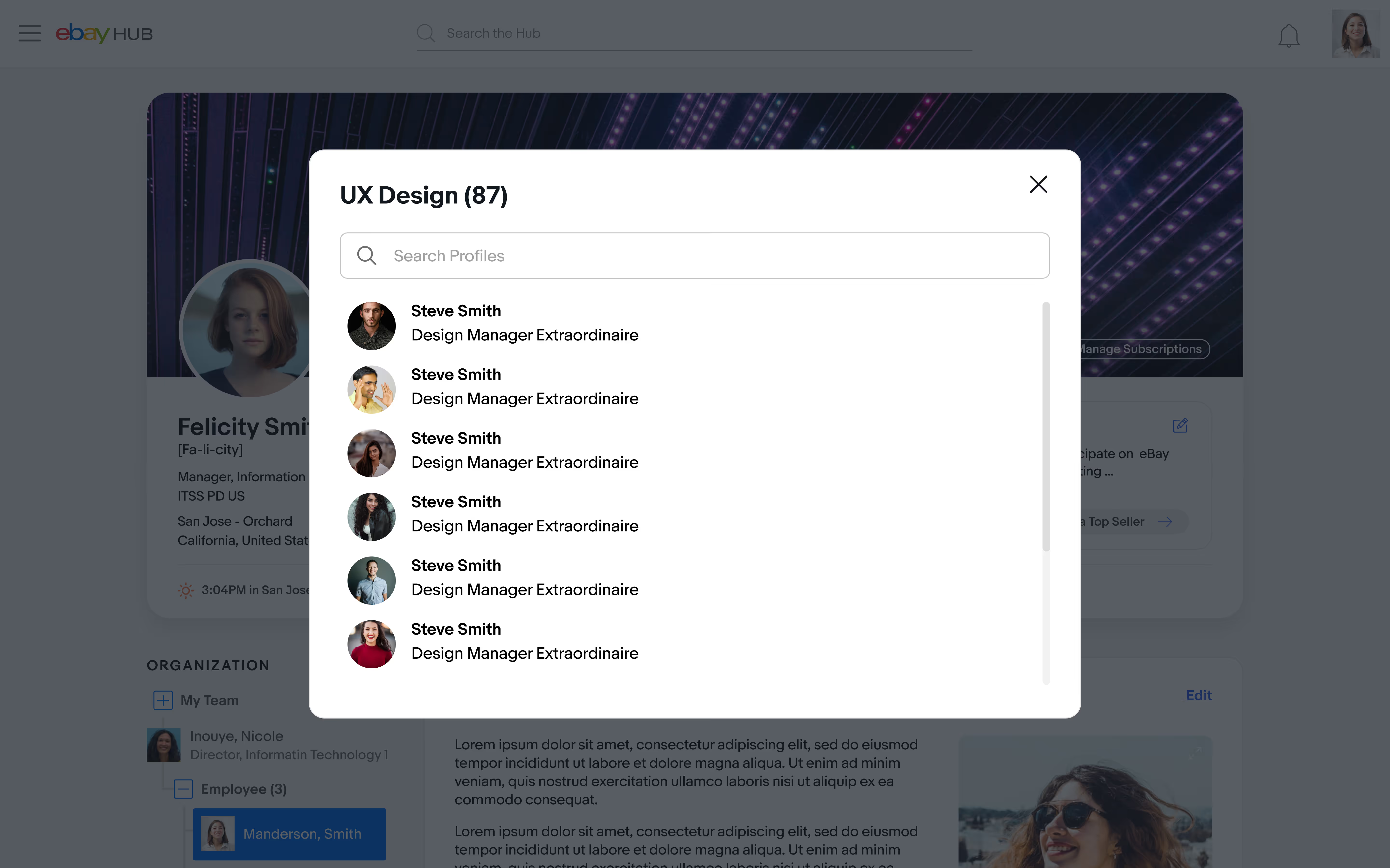
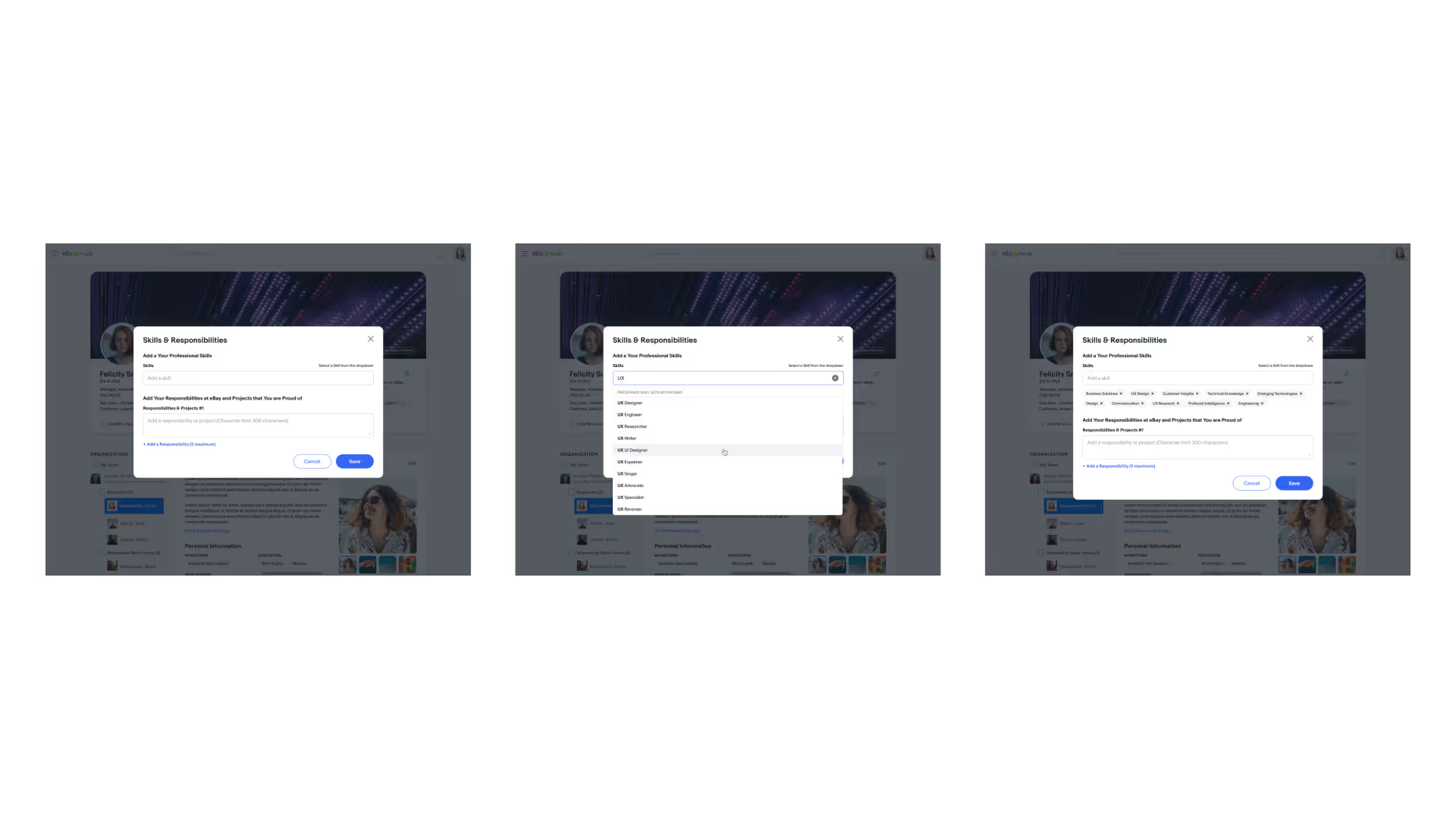
The shipped profile added cover images, keywords, and expanded sections for education, bios, interests and skills, which made internal talent sourcing workable. It also gave quick access to files, timezones and company holiday calendars.

Federated search
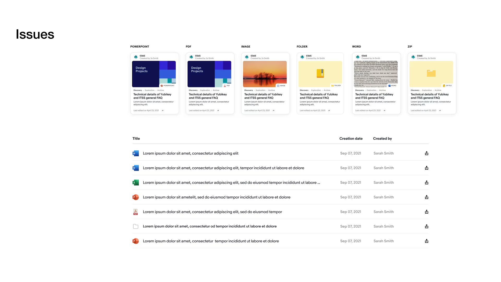
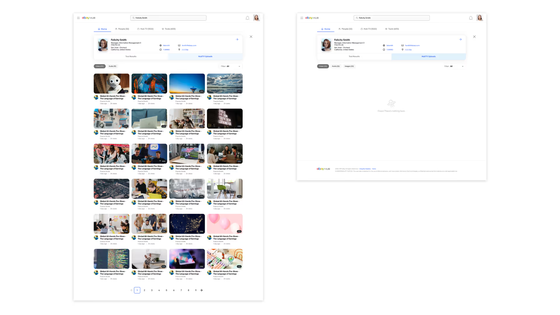
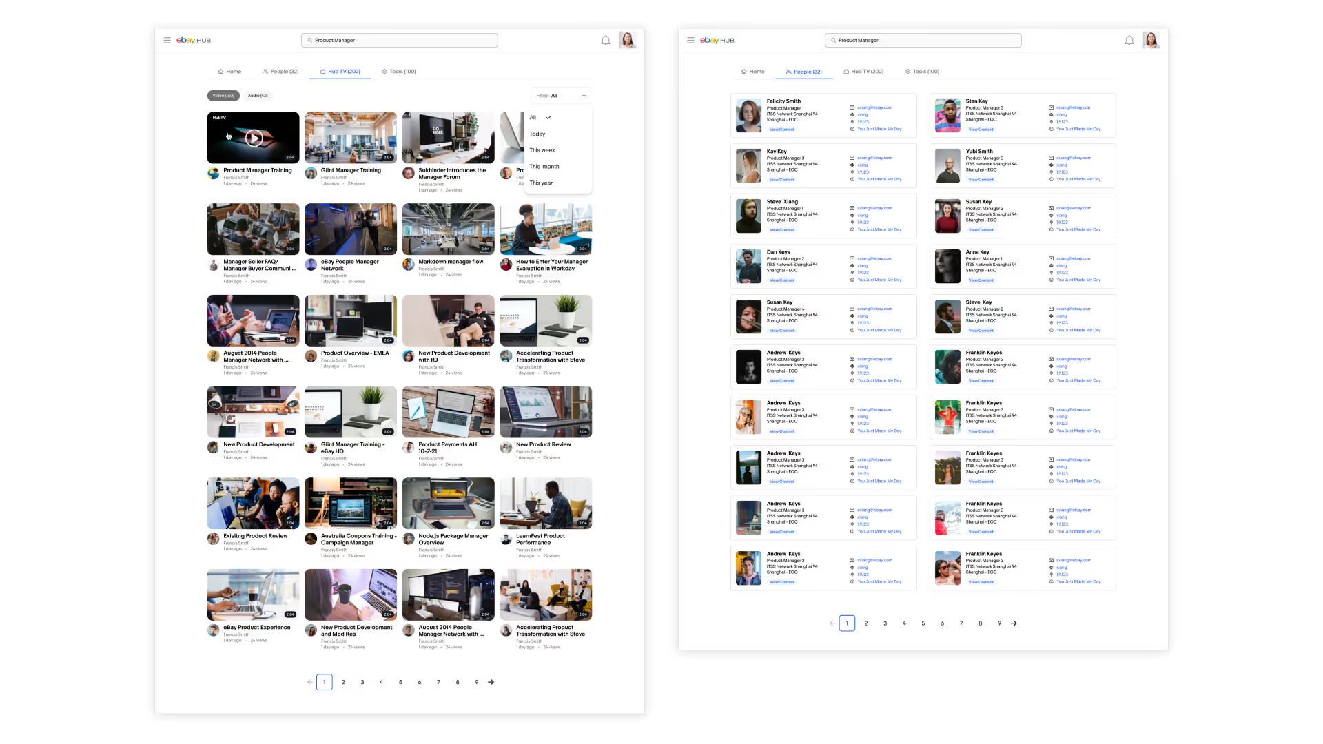
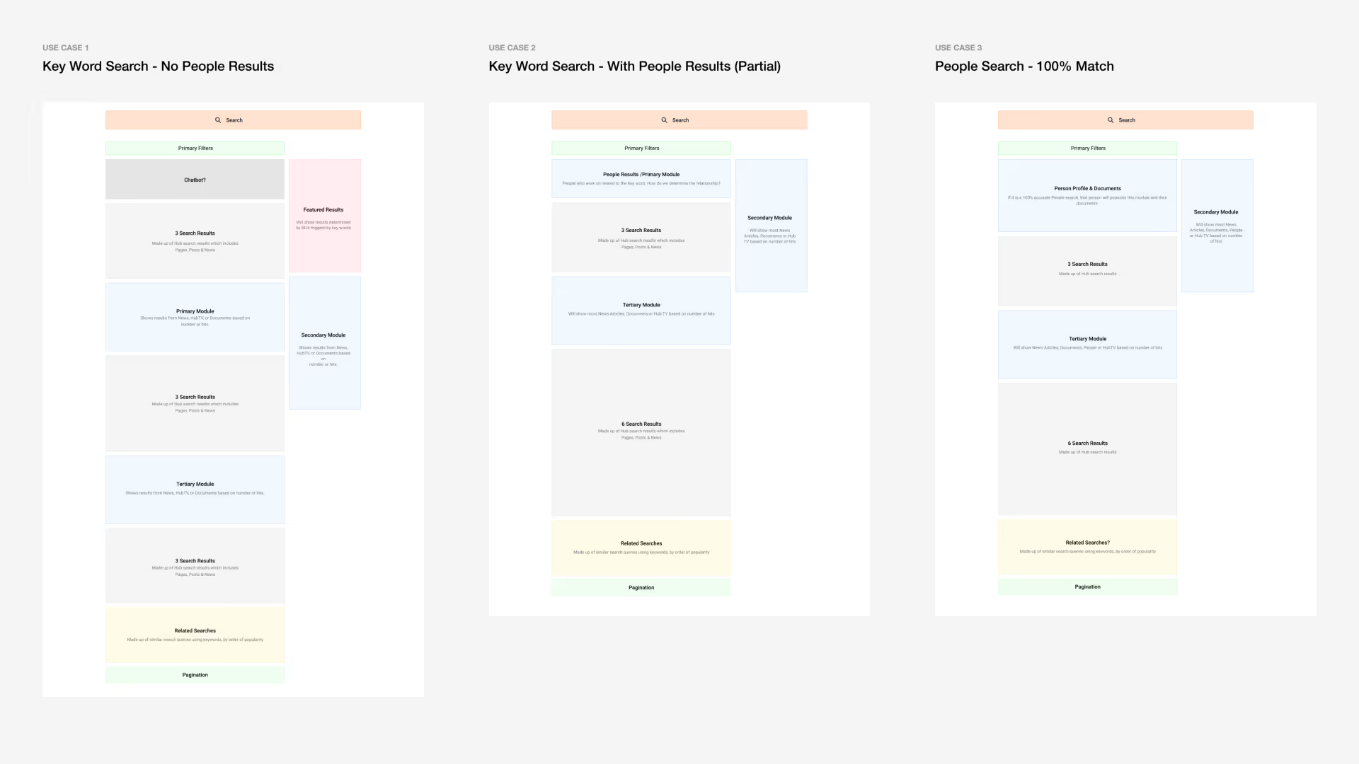
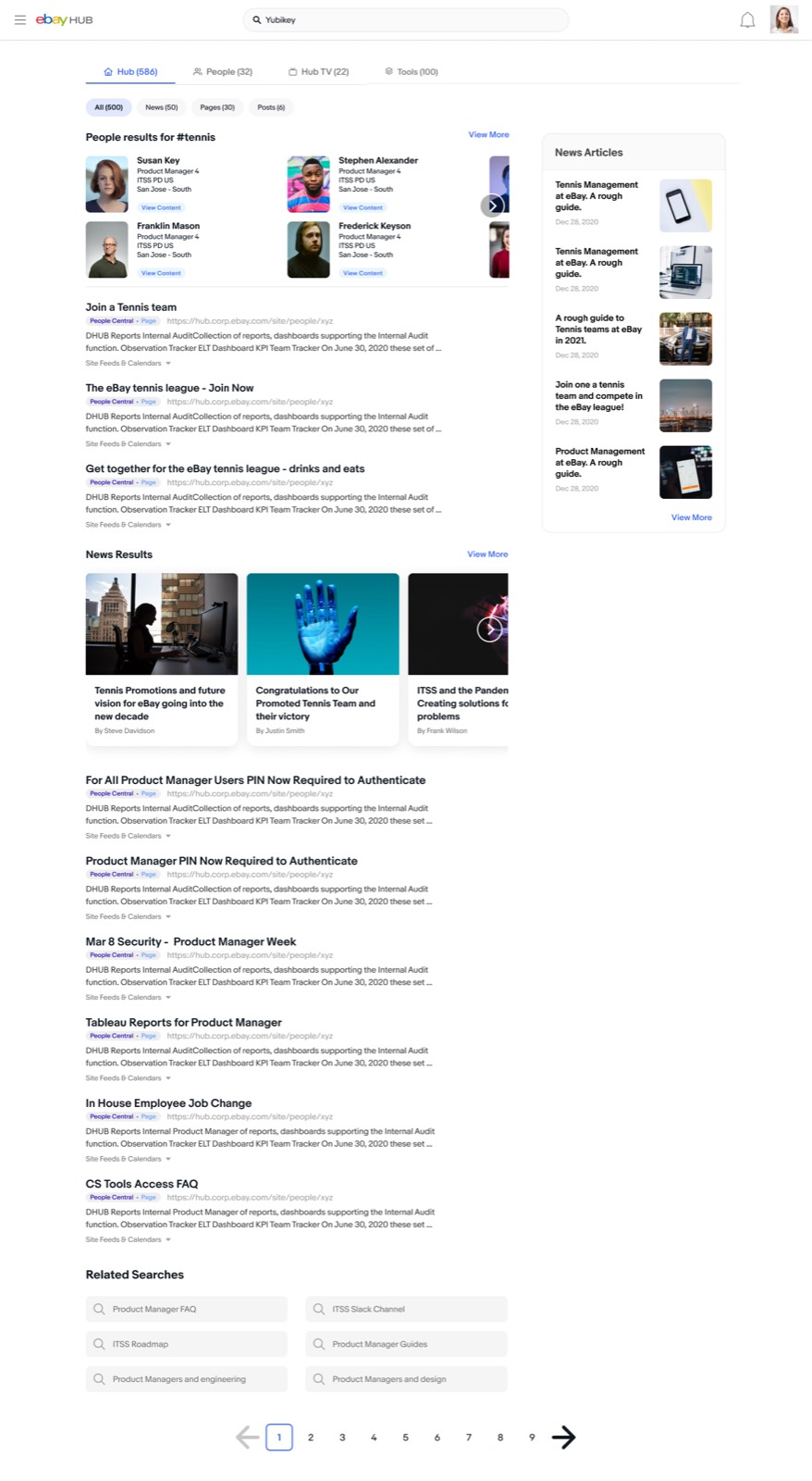
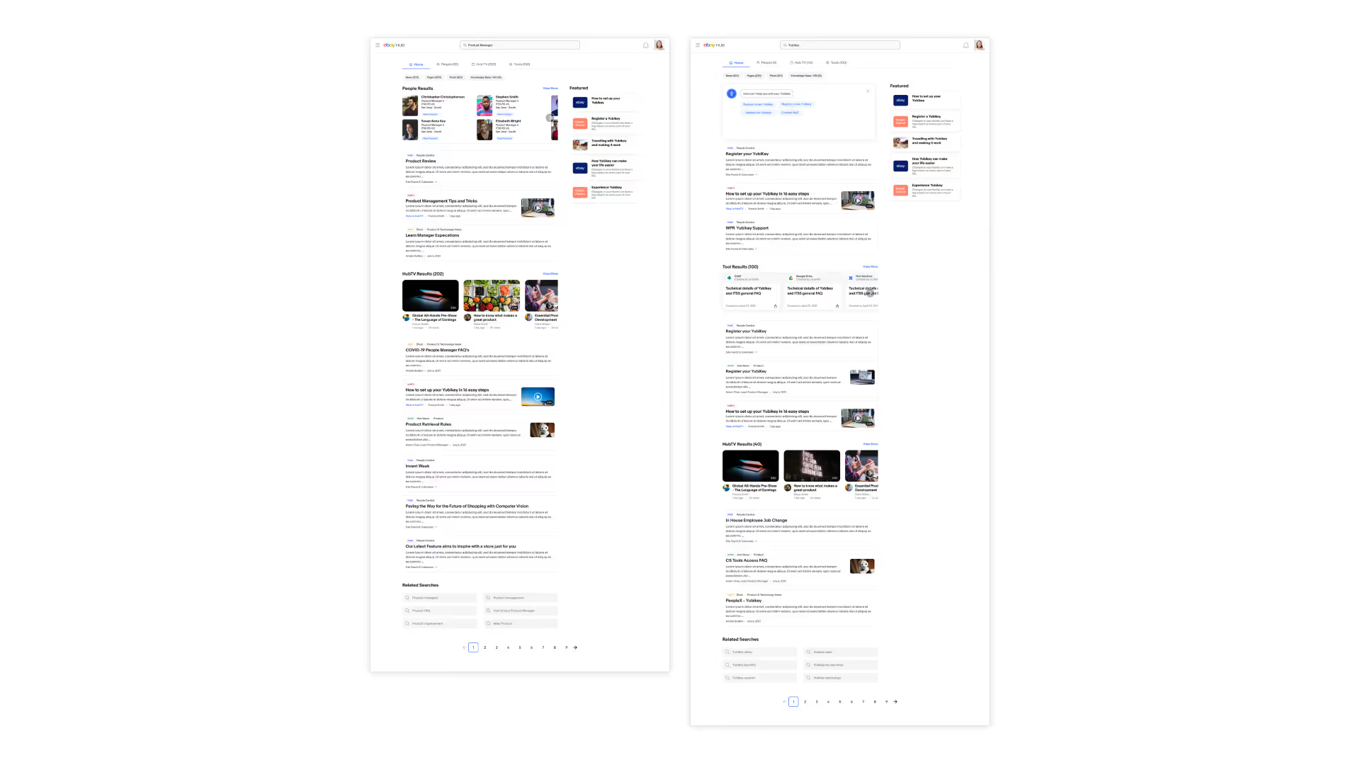
Search sat alongside the profile work: one search box that reaches across people, pages, tools, and documents, with results grouped so the right kind of answer surfaces first.
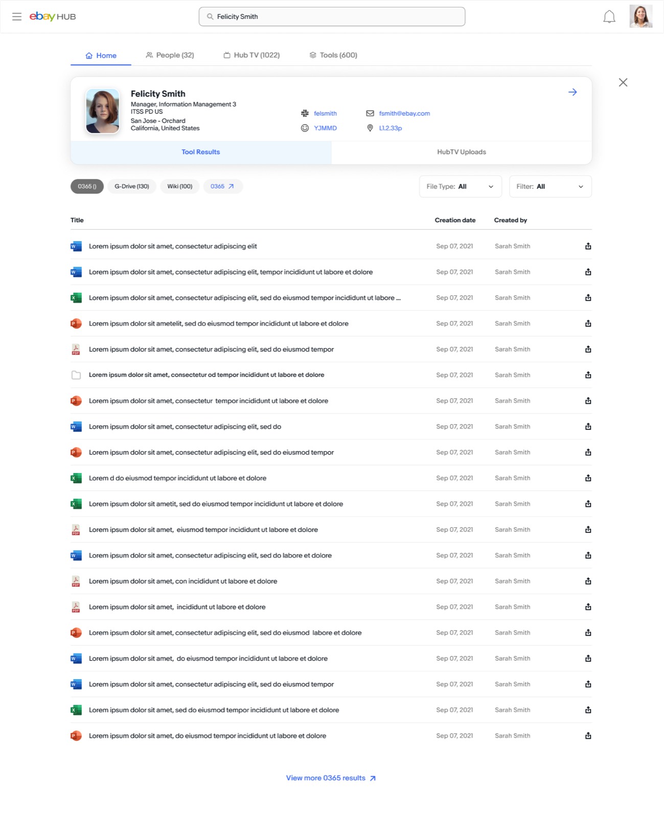
The shipped version pulled results from The Hub, third-party platforms, video content and employee profiles into one UI, built on the search patterns people already knew. People search let you open a colleague’s shared files in one click, and the result groups were designed so new platforms could be added later without redesigning the page.
Results
Both redesigns shipped, and the changes showed up in the numbers over the following releases:
- Profile web traffic up 16%, profile interactions up 19%
- Search web traffic up 18%, search interactions up 21%
Beyond the numbers, search and profiles now link to each other, so finding a person and finding their work is one journey instead of two.