Process, approach, and outcomes:
A product of its time
The previous version of the platform had a minimalist and unfriendly design. The video thumbnails were tiny, and never seemed to change. Content wasn’t well sectioned. There was an enthusiastic overuse of radio buttons, and a lack of visual impact throughout. It was a product of its time.
A huge surface area
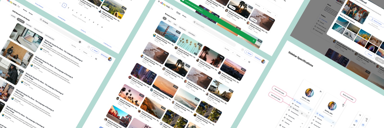
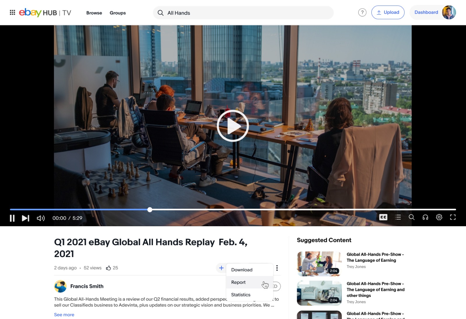
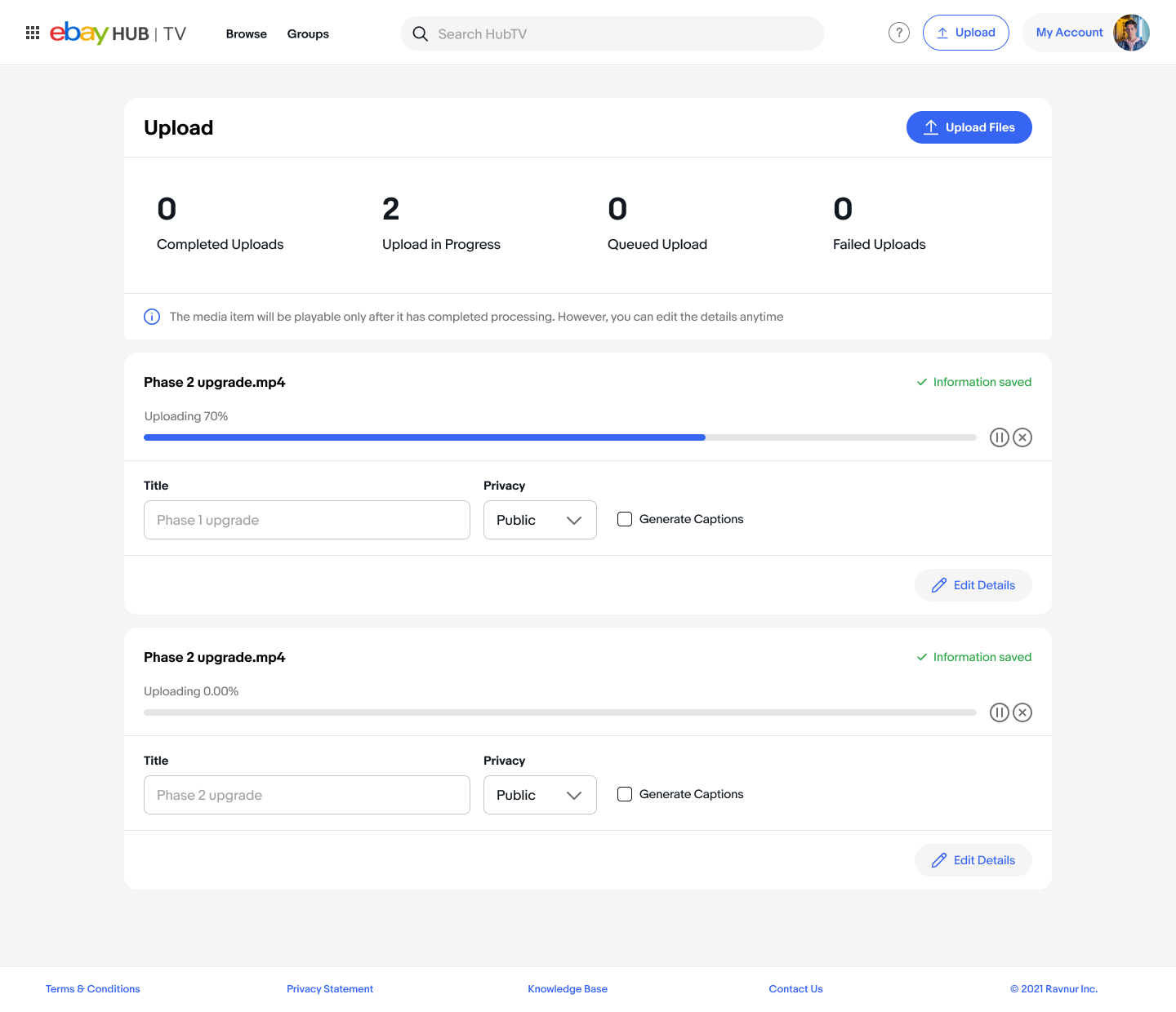
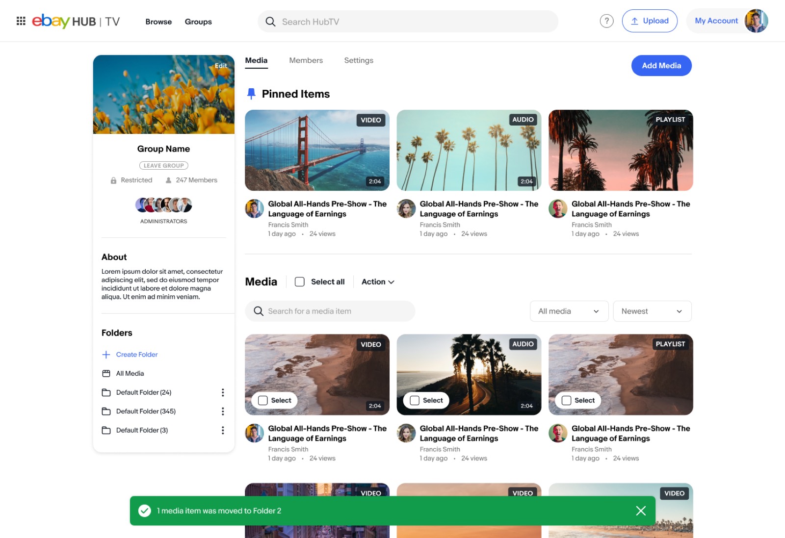
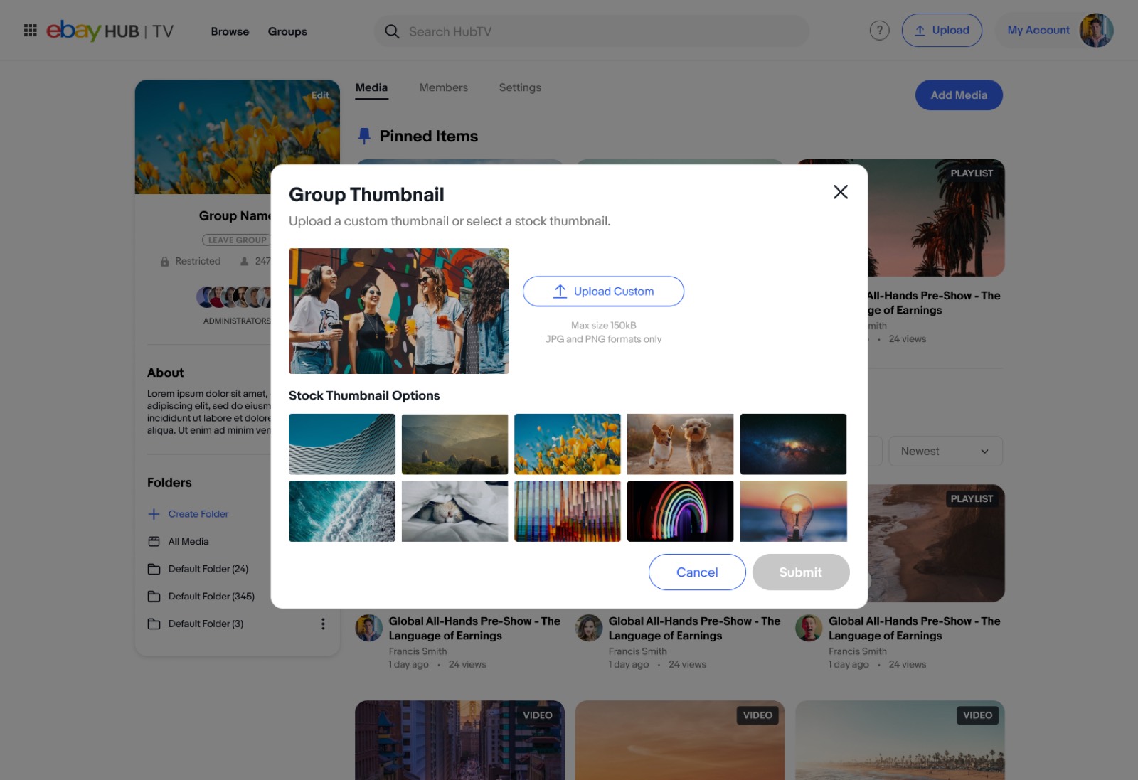
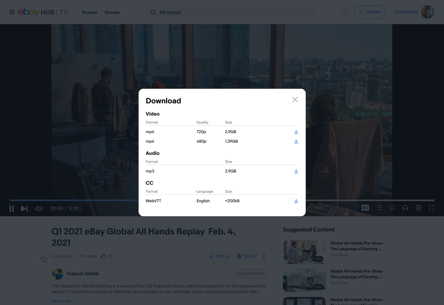
The project involved a redesign along with a number of UX changes to make the platform simpler to use. There were a huge number of screens and states to design for: the homepage, search results, the browse page, uploading and editing videos, personal and public account pages, updating filters and sorting, and more.
Making content discoverable
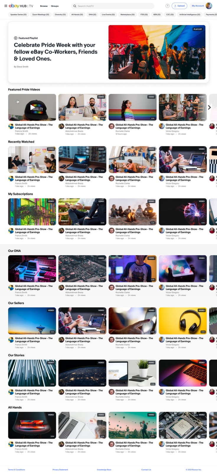
The homepage used pills suggesting popular searches, surfacing content people wouldn’t otherwise have found. Alongside that: videos from channels users had subscribed to, and showcase rows for campaigns running across the company.
The outcome
The end product was a far more functional and modern application: easier to browse, easier to search, and much better at putting the right video in front of people.